Showing posts with label design. Show all posts

Thursday, December 06, 2012

How About You Decide? (Gaming Post No.2)

Pic from www.guardian.co.uk
The launch of the WiiU has caused a lot of debate around the gaming community. As with the first Wii console, the 'hardcore' gamers have been scathing in criticising Nintendo for producing something that isn't an all powerful technical behemoth, even though they haven't done that for any machine in over a decade.

Nintendo have always been smart at making the very most from their machines, taking something that is technically less powerful, but utilising it in a way that produces great end results, and importantly, is profitable. Sony got every major technical decision on Playstation 3 wrong, Nintendo rarely do.

The key question though, is what exactly IS WiiU? It feels initially like a machine that has had tons of things chucked at it in the hope that some of them will stick, yet on closer inspection it feels far more clever.

A touch screen in the middle of a gamepad, compatibility with the Wii controllers, it feels a bit like trying to cash in on iPad mania, until you look more closely at the details.

The handheld screen shows two bits of possible thinking that are beyond what Microsoft or Sony have previously done. Firstly, sales of handheld consoles are dropping. Ownership of phones and smartphone gaming mean fewer people are buying, and those that do are far less likely to play them outdoors. So suddenly this screen gives you the option to play your game in bed without having to buy a separate handheld machine and a new catalogue of games. You could also use it to watch Netflix in bed.

Secondly, multiplayer gaming in the same room has always been spoiled by the need to use split screen. The new controller screen finally takes that away, allowing two player gaming with one TV and no splitting of the screen. It also means the usual four player limit on games can go up to five.

Cute pictures and game related chat.
Miiverse even adds a tick to let you know if the person
 writing actually owns the game they are talking about!
Even Miiverse and it's ability to draw players into a simple online community around each game they play, without the horrific over competitiveness and conflict you get on Xbox Live or PSN. Several early users have said the Miiverse has become like Facebook, something they check each morning.

When Apple launched the iPad, there was a lot of talk about where it would sit in the world. People have laptops and smartphones, why would they want a hybrid? Apple, instead of trying to define a position for the device, just showed all of the possibilities and let people and developers work out for themselves what they wanted it to be. Nintendo appear to follow the same strategy in recent years, DS, Wii and now WiiU all take cheap and clever technologies and compile them together into a bundle that can be used in many different ways.

For example: The streaming technology means that the console can process a controller action, send it to the console, update the game, compress the image, send it to the controller and display it with less lag than the average high quality LCD screen. This makes it remarkably responsive, even when used several metres from the machine. It also opens up the WiiU to be used with technologies like Onlive.

So while it looks a little bodged together, what Nintendo have actually delivered is something flexible. A machine that gives developers and gamers a huge scope of choice in the way they wish to play their games. This is why, no matter how weird their machines looks initially, I always trust Nintendo to deliver something worth owning, they think better and they plan better than the competition. Now if only their ads matched up to that thinking!

If you are interested in more games stuff, I've also been doing some writing for a new Gaming Site - Voxel Arcade.

Tuesday, August 16, 2011

Bad Design is... Bad

I have been frustrated recently by a number of pieces of bad design and packaging I have come across. Something which partly seems to be related to the Sainsbury's bag problem. Whereby to save waste they make the bags thinner, but that means they split open so much that you haveto put less in each one, and often double wrap stuff leading to you using far more bags than before.

1. Flora Buttery

Nice product, terrible packaging. The lid doesn't fit well onto the tub. It feels half on, but if you press it down it rips and then doesn't stay on at all. Useless, to the point where i don't want to buy it.

2. Nestle Ice cream mini tubs

I bought one of these the other day. I pressed the lid down and it didnt go, until the whole tub scrunched up into a mess. Useless.

3. Muller

My wife went to buy a load of muller yoghurts yesterday. Normally they are colourful and you can pick them out easily. Except someone at Muller decided it would be good to rebrand all of them blue, making it ten times harder to work out the flavour you are looking at.

In addition, they were all stored in those cardboard containers, which were all the same blue with a Muller logo. What used to be an easy to navigate range became a total wall of blue. After looking around for 30 seconds my wife gave up and didn't buy any. I bet she isn't the only one, horrible case of design that doesn't check for usage.

Friday, June 17, 2011

Culture under the cardboard box

I'm sure this must have been done in some capacity already, but it feels like something I would like to start or develop in some form...

I was randomly humming an old metal track, and discussing it with a colleague; when I thought about the idea of trying to covertly get the song into the heads of other people in the agency. A kind of unknowing cultural experiment where people could end up humming a song they had never heard before in a genre they probably don't listen to.


How can we create Covert Culture?


That got me thinking about the other possibilities of inserting culture into places it doesn't naturally fit. Music is an easy form of this, nudging a song into people's memories. Yet you could also do this with art, or poetry, design or even philosophy. A way of encouraging the absorbtion and trial of wider cultures and ideas.


The closest fit I can think of is graffiti putting personal comment into random locations, but I'd like to see something with more of a cultural agenda than a political or personal one.


Maybe it's putting art postcards in copies of Twilight. Putting a USB stick of classical music on the bar at a rock gig. Putting a book on the seat of a bus.


There must be hundreds of ways to spread culture in a covert manner. I'd love to think of a way to bring this to life...

Monday, December 06, 2010

A Note for Myspace

When spending a shitload of money to redesign and revamp your site, change your identity and refocus your business model; you really need to pay attention to how people use it.

The old myspace site was slow, cluttered, full of conflicting navigation, full of irritating ads. The new myspace site is slow, cluttered, full of conflicting navigation, full of irritating videos and ads.

They have clearly learnt nothing at News Corp. Even at its worst, Facebook lets you see everything you want in one go, at minimal fuss. Myspace wants you to drag and search around before you find anything.

It's not like they didn't ask. I did the longest questionnaire in history a few months back describing everything that was wrong, and what we got was the same site but looking a little nicer.

Focusing on music is a smart move for myspace, sadly they seem to have got everything else wrong.

Friday, July 20, 2007

Post of The Month! : Updated

As the original post of the month appears to have fizzled out somewhere in the blogosphere, I thought i'd start it up again.

Please post your nominations here, they can be any posts on advertising, branding, marketing, design or similar topics. Originally posted or majorly updated from 1st June to 15th July.

Once the nominations are in, voting will commence!
I shall try to dig out a small prize for the winner, as well as the honour (ahem) of being Ad Pit Post of the Month! ... and no voting for yourself!!

I really hope this will work, as I think its important to bring people together to see the best of what's going on in the land of blogging :)

Image from www.worldsoccer.com

Nominations so far:

Charity Begins With Home - Rob Campbell

Who Dunnit - Raymond

Agency Ecosystems - Logic + Emotion

Tuesday, July 03, 2007

Clean Design...

I've always loved design. Though i'm not a brilliant designer, its something i've always enjoyed looking at and studying. Having just bought one I feel obliged to write about my favourite piece of product design in quite a while:

The Indesit Moon Washing Machine
(image from Dixons)

What I love about it is that not only does it look unusual and modern; but that most of the more radical design features are based upon improving thefunctionality of the product. The door is solid as it houses the detergent dispenser, removing the need for a drawer (which is such a rubbish device I cant believe its been used for so long).

The controls are so simple, and light up so you can clearly see both what setting you are on and how long is left (it counts down like an old schools tv clock).

It looks fantastic, and has so many great little touches. If only more white goods had this design care lavished upon them...

Tuesday, June 05, 2007

How Lo Can You Go?


Wow. The fuss over the new London 2012 logo is immense.
Designed by Wolf Ollins, it has a weird Jet Set Radio feel to it.

I like it moving, but im not sure about it still, and I dont think much of the colours. A bit too early 90s fluro...which is in style now, but in 5 years?

Its not timeless, but it might just be perfect as a piece of design to fit a specific moment. Time, and fashion will tell...

Thursday, March 29, 2007

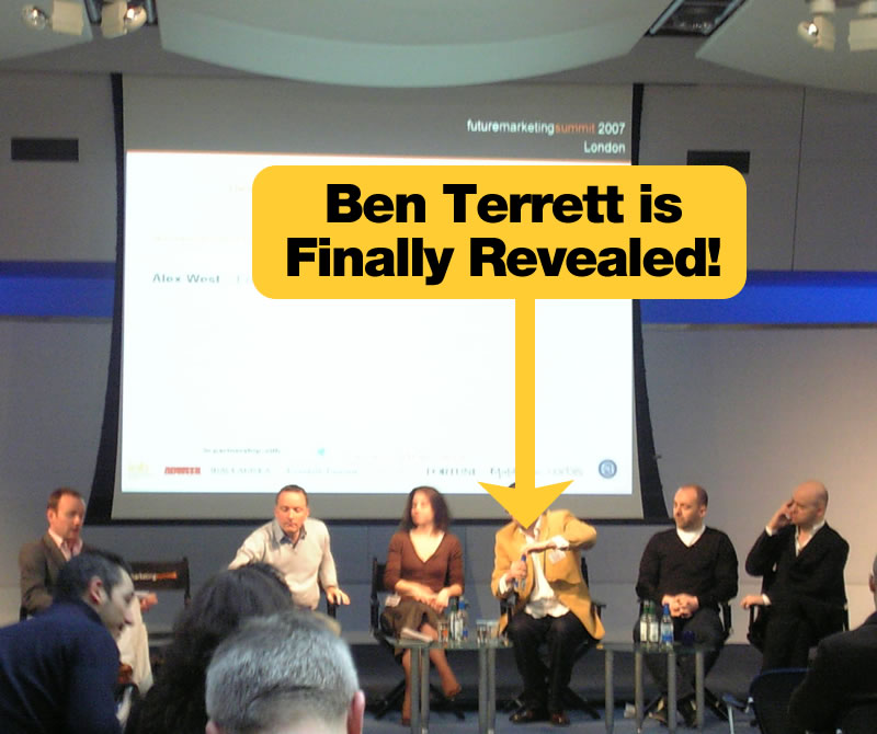
Design Mystery No1 Solved!

Finally it has been done.
The ad pit can exclusively reveal what every graphic designer worth their salt has been wondering about for several years.

What does Ben Terrett of the Design Conspiracy actually look like?

An exclusive picture from the Future Marketing Summit!

Tuesday, March 27, 2007

Neinsteins Theory of Advertivity

One thing that always puzzles me is why planners (and designers and creatives as far as I know) always obsess about theories and theoretical charts. Is it a good thing or are we losing track of the bigger picture?

Recently our blogosphere has seen debates on big ideas vs small ideas, prog vs punk ads and so forth. But is it not the case that there is no right answer?

I like electronica, but I know not to play it at a Slayer gig. I like heavy metal, but I know not to play it at a wedding. Why is it that we often try to fit one type of music to every event, surely the best type of solution is the one that is most relevant to the brief and client?

Its also the case that even when a theory is right, it doesnt always stay that way. Einstein's theory of relativity has been effectively challenged on many occassions. Just because Bernbach and Lever were right back in the 50's and 60's doesnt mean they are 100% right now, but it also doesnt make them wrong.

So.

Do we theorise too much? Or are we justified to do so providing we always stay true to the needs of brands and clients? Or am I wrong too?

Monday, February 19, 2007

The Future of Marketing

With the Future Marketing Summit coming up, I thought it would be interesting to see what sorts of topics you think would be worth discussing and talking about for advertising, design and marketing.

I know some very clever people read this blog, so i'd love to hear your suggestions for talking points!